UX/UI

Netography Filter Component Redesign

Improving the Controller UX

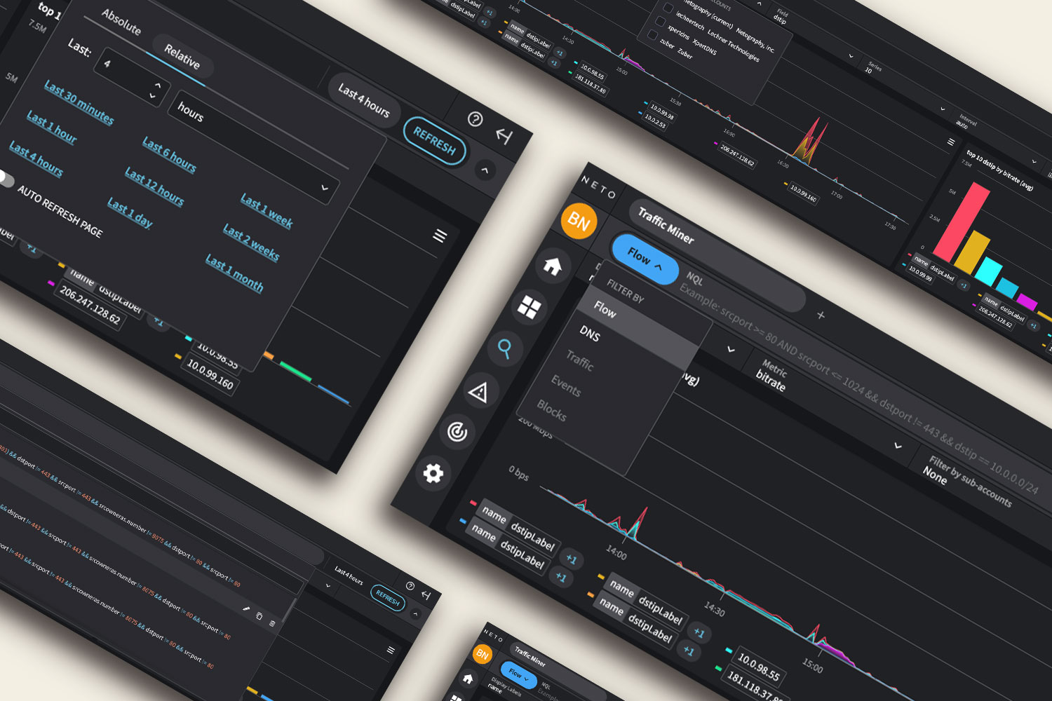
The controller housed critical inputs, but its original design consumed too much space and was hidden by default, requiring users to expand and collapse it repeatedly. This disconnected the filters from the data shown, making the user experience fragmented and confusing. I redesigned it to be more intuitive, visible, and directly connected to on-page results.
The Solution

The Global Controller was redesigned into a compact, persistent form factor that keeps filter settings visible at all times, without sacrificing functionality. This reduced unnecessary clicks and clarified the connection between selected filters and the data displayed below. The new approach was inspired by travel booking interfaces, where search results are always anchored to visible, editable criteria like dates and filters.

Original design | New design
New Design
Traffic Source Selector
Date & Time Selector
NQL Selector
Additional Options